Fedora 34 - First Impressions
May 17, 2021
Finally, it is time to try a new Linux Distro. Fedora 34 is the distro I am deciding to dip my toes into, and with it will come a recent version of the Gnome desktop. I have been busy recently and have not really had the desire to spend time trying out yet another distro of Linux. I am pretty set on Ubuntu; I know it well and often, I just want to get to what I am doing, and not worry about figuring out how to get something done within an OS. But Ubuntu is a little late to adopt the recent version of Gnome, and I was interested in the big workspaces change that came to it. So, let us dive in.

Install Fedora 34
Installation
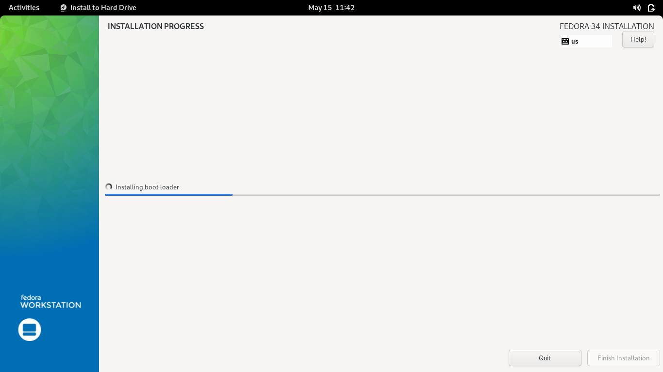
Downloading the ISO and installing was super easy. The only thing I ran into during the install process was a little difficulty recognizing my SSD. I had to back out of the selection process and go back in before it prompted me to delete the partition. Once I was past that, everything installed quickly. Of note, I selected the install option from the live session, and once the process was done, I thought that it would prompt me to restart and remove the media; it did not. I had to manually restart the computer.

Install Fedora 34
Gnome 40 Desktop Environment
The new Gnome 40 desktop is similar to the previous one. Same black bar at the top with Activities, Time and Date, and the small system icons tray. The same Adwaita theme is in place. While I do think the default Gnome theme is nice, I prefer the Ubuntu theme. Since Red Hat plays a significant role in the development of Gnome, it makes sense to use it. I did not like to find out that I cannot change the theme to the dark version without installing the Gnome Tweak Tool. Something basic like that should really be in the default system settings.
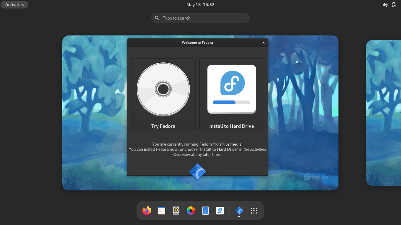
Kudos to Fedora for also including a walk-through pop-up for the new Gnome desktop. That was a nice touch for anyone that may be unfamiliar with how Gnome functions.
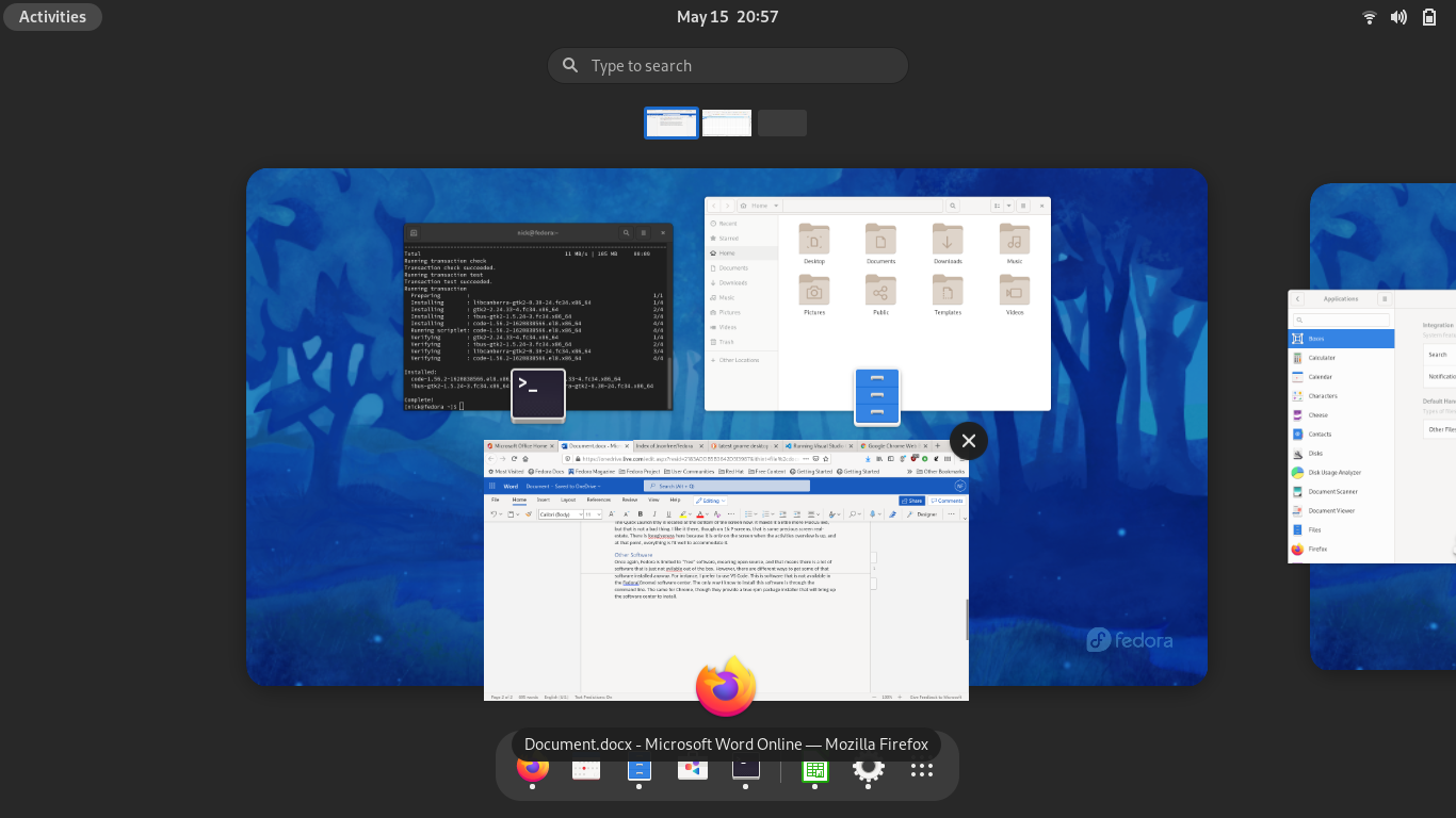
The new Activities Overview is where the major changes have taken place. The workspaces are now arranged horizontally. There are new gesture controls that allows for a three-finger swipe to navigate between them, which I have not been able to try out. The laptop that I am using this on is old and I do not think supports three finger gestures. When you activate the Activities Overview, the windows on the highlighted workspace arrange over top the workspace in a nice fasion. I did not think that I would like how they overflow the workspace itself, but it looks good. The animation when scrolling through the workspaces is slick, and I have found all the animations to be very quick and smooth. That says something about the optimization, given the old hardware this is running on. Ctrl + Alt + the left or right arrow switches the workspaces as well, and this animation is equally fluid.

Activities Overview with apps
The Quick Launch tray is located at the bottom of the screen now. It makes it a little more MacOS like, but that is not a terrible thing. I like the shortcut dock there, though on 16:9 screens, that is some precious screen real-estate. There is forgiveness here because it is only on the screen when the activities overview is up, and at that point, everything is fit well to accommodate it.
The icons are improved, though I still do not like the icon for Nautilus. A blue and white set of drawers is just not pleasing to me, but the flatter icon that default Gnome has switched to is better than the old one.
Other Software
Once again, Fedora is limited to “free” software, meaning open source, and that means there is a lot of software that is just not available out of the box. However, there are multiple ways to get some of that software installed anyway. For instance, I prefer to use VS Code. This is software that is not available in the Fedora (Gnome) software center. The only way I know to install this software is through the command line. The same for Chrome, though they provide a true rpm package installer that will bring up the software center to install.
I have installed RPM Fusion, but I have never used it before, so I am going to have to investigate it further. I will have to try more things with this OS to see if this is something that I could switch to. Some of the things that make it hard for me to want to switch distros at this point is knowing the commands on Ubuntu/Debian.
Firefox is the default browser, like it is on more Linux distros. I am a little sad at the state of Mozilla and hope that the Firefox browser can maintain. I really like using it over Chrome and have managed to switch to it on every device that I have. A quick sign in and everything is there, including passwords. This makes transitioning easy. I logged into the browser, went to Office.com and accessed my documents stored through Office 365. Of course there is Libre Office available, and I know there is an open-source way I could sync all of these files, but right now I pay for Office 365 for my wife, so I decided to make use of it.
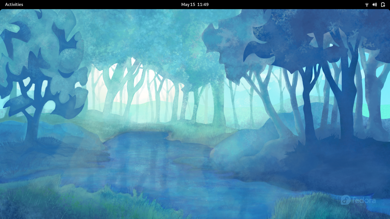
The new default wallpaper is great. I really like the different shades of blue. A few odd things I have noticed in the few hours I have spent playing around with it. Some applications are default in dark mode. Terminal and Video player are in dark mode, but everything else is in the normal mode. This is not a big deal; honestly, I would prefer dark mode. But it is inconsistent and does not make sense.

Fedora 34 Desktop
Overall, I am enjoying using Fedora 34. I will have to spend some time getting it set up for web development. I like to see how easily I can replicate what I do on my main machine. If it is easy to get everything running on it, maybe it is worth it to switch. We shall see. For now, it is a nice system, and I like the changes to the Gnome desktop.