Fedora 35 - First Impressions
April 28, 2022

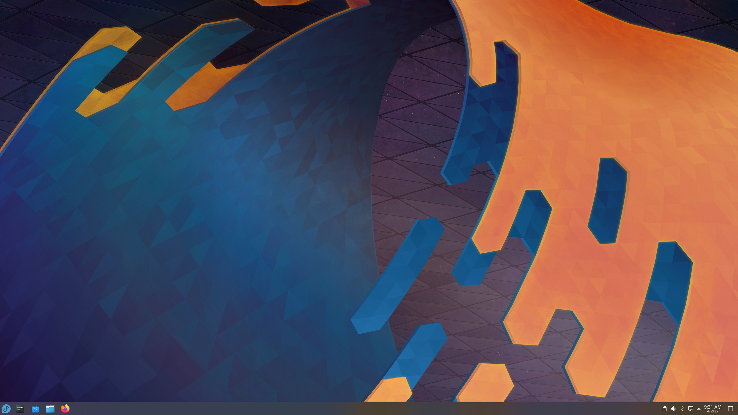
Fedora KDE Default Desktop
Finally, it is time to try a new Linux Distro. Fedora 34 is the distro I am deciding to dip my toes into, and with it will come a recent version of the Gnome desktop. I have been busy recently and have not really had the desire to spend time trying out yet another distro of Linux. I am pretty set on Ubuntu; I know it well and often, I just want to get to what I am doing, and not worry about figuring out how to get something done within an OS. But Ubuntu is a little late to adopt the recent version of Gnome, and I was interested in the big workspaces change that came to it. So, let us dive in.
I have certainly tried other distros, but never truly committed to using one that was not an Ubuntu base, or just plain Ubuntu. What does it mean for me to commit? I am talking about installing it on my main laptop that I use for everything other than gaming. It means using it for an extended period, and even when I am at that point of turning back, committing again and sticking with it.
This time I chose Fedora 35 with KDE Plasma version 5.24.3. And I can say that as of now, I am still loving it. The interface is similar to Windows, which I thought was going to be a point where I just decide to nuke KDE and go back to Gnome, but that has not happened. . . yet.
Interface
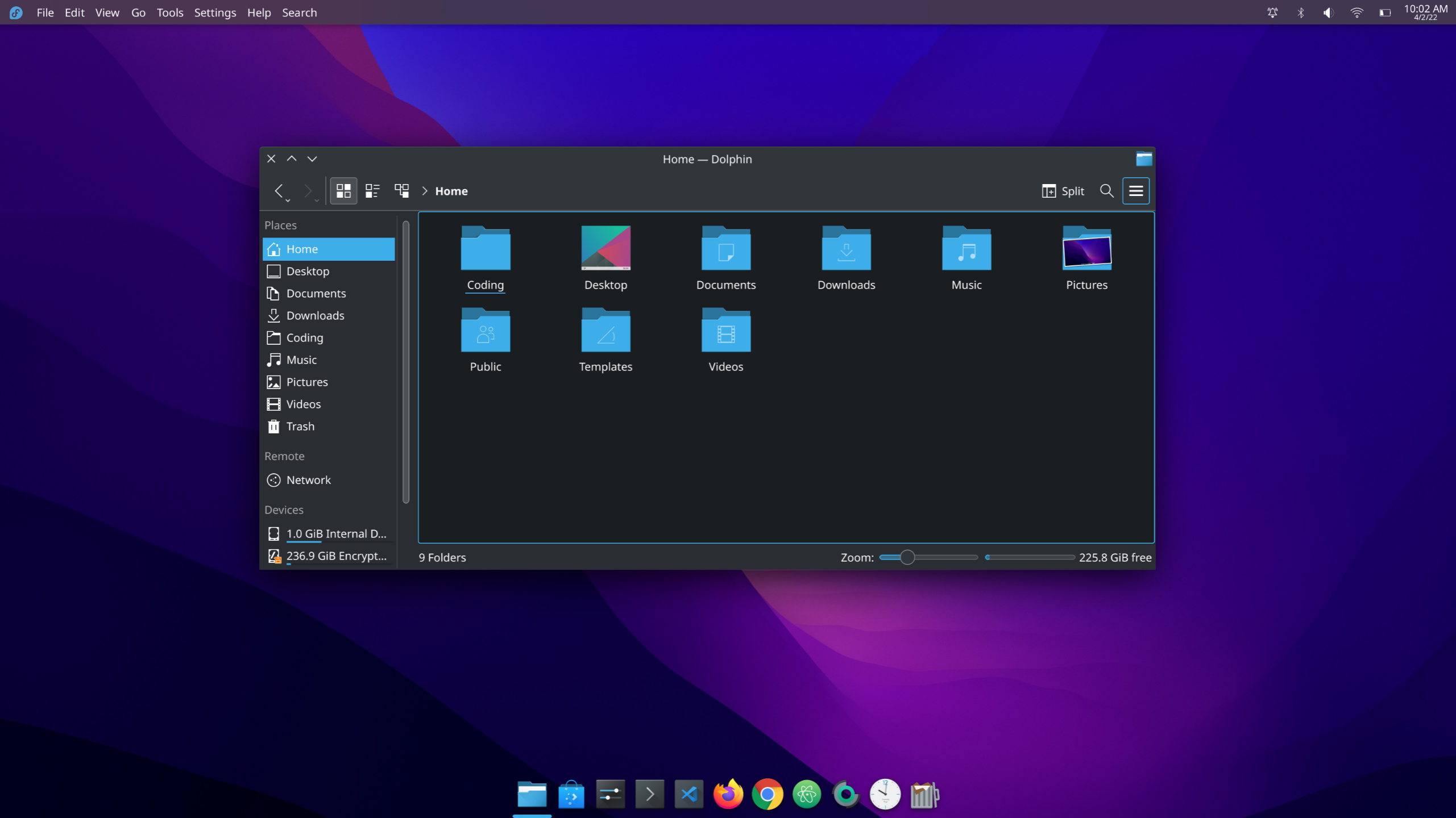
I will start with KDE. As I stated, the interface is very similar to Windows 10. I now run Windows 11 on my gaming laptop, but I still use Windows 10 every week day for work. This is where I figure the similarity to Windows will start to irritate me. I have long found that if I want to use a computer outside of work hours, I usually need it to feel different enough that I do not feel like I am still working. Thus far I have not felt that, though I did have a moment where I made KDE look like MacOS.

Fedora KDE looking like MacOS
I have switched it back because I was facing small issues with the panels and Latte dock when switching from the laptop being docked and having two monitors and undocked with only the built-in display.
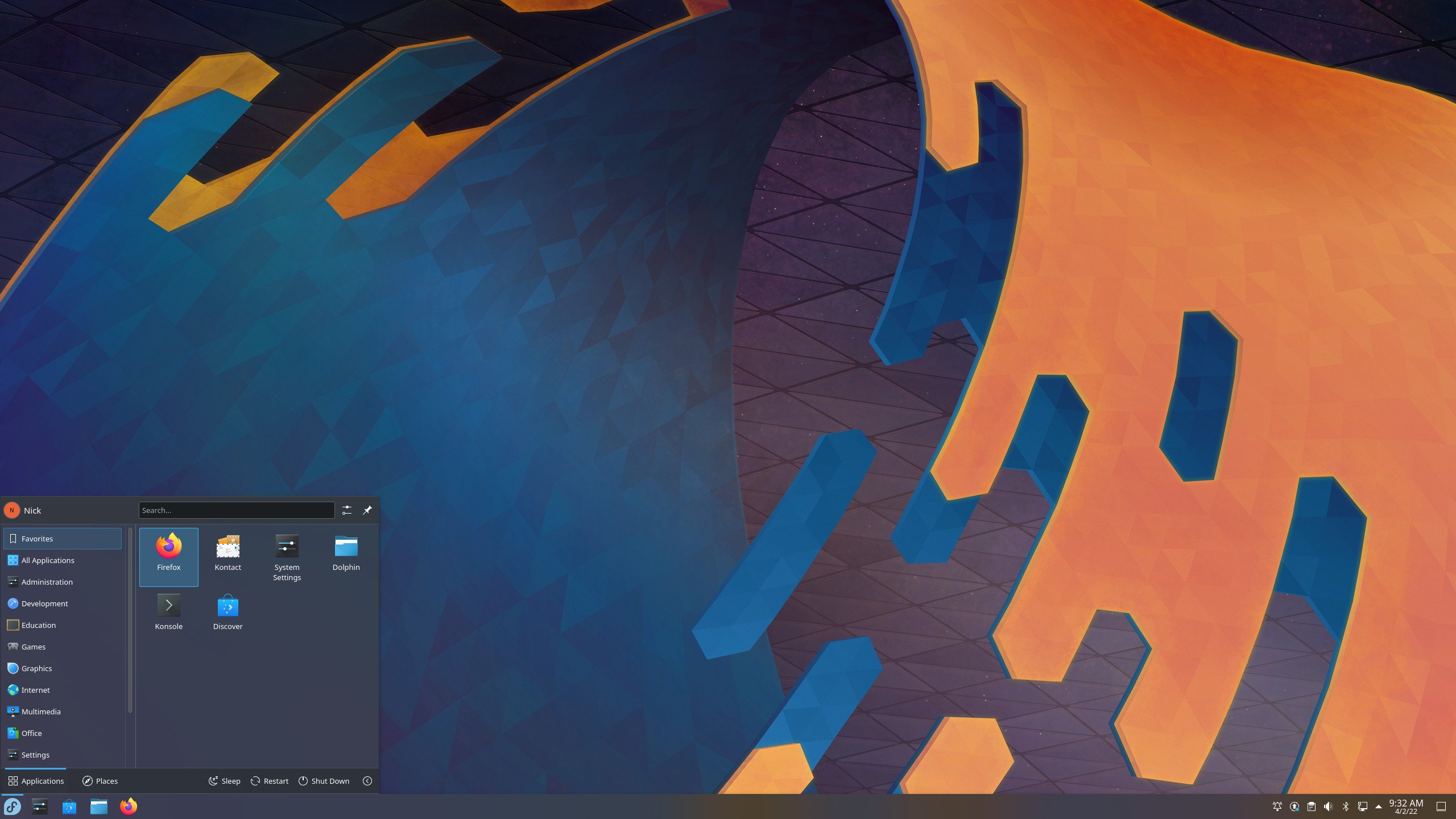
The application menu, by default, is very different from the one I used previously. I am used to a menu with favorites showing by default, and then several tabs across the bottom to navigate to all applications, shut down options, etc. This new one is designed to put all of that at the user’s fingertips right away. It makes the menu vastly more efficient.
The default wallpaper is very nice, as are the rounded corners on the windows, and just the general look and animations. There are some functionality fixes I had to add, such as Super+Tab popping up and open applications overview. And with that, slowing the animations down slightly since the normal speed makes the applications overview look crazy. I would have been fine with animations otherwise but having some of the others slowed down slightly actually makes them look better too, like opening and closing menus.

Fedora Application Menu
The fact that all this customization can be done to the interface by default is amazing. While I have come to appreciate Gnome’s interface and workflow, it is not significantly customizable out of the box. And that is ok but being able to make KDE function the way that one would like is powerful. It is also great that it remains lightweight and snappy.
Dolphin file browser is also great. There are a lot more options for it and I have really come to appreciate it more than Nautilus. It is designed for someone that would like to make it work for him rather than feeling simple and limited.
Applications
Applications is an area where I still prefer Ubuntu, and I think a lot of that is just the ease of Snaps being built in. Snaps being pushed on the user is the reason I jumped ship. And while I understand that Snaps are highly usable and it is possible to uninstall Snapd and continue to use Ubuntu as normal, I disagree with the direction that Canonical is going in preferring Snaps over repositories and direct installations of applications where it can be done.
Mostly I have been able to install any application that I want. It took a little more effort on Fedora, meaning downloading RPM packages for Chrome and Visual Studio Code, or running some terminal commands for Atom, but I was quickly able to get everything that I need. The one application that I do not have is Spotify, which would require me to install Snapd. I may yet do that, but I rarely am listening to Spotify on my computer anyway.
Installing development tools like NodeJS and NPM was very easy. I just followed to documentation online and away I went.
I needed to format a USB drive and initially go GParted as that was the application that I understood. GParted, of course is a GTK application and does not play well with the screen scaling that I need to make use of on my 2k monitors. The application was rendered very difficult to use, so I went looking for another application switched to KDE Partition Manager. GParted is my default, and I have to remember that KDE pretty much has all the basics included, or there could be some alternative applications that are designed for Qt.
Final Thoughts
I am liking Fedora and KDE at this point. It works well with the ThinkPad x1 Carbon that I am using it on. All of the functions work well and other than missing Gnome, I am enjoying using the system. There are some great advantages in using KDE, mostly the customization that comes out of the box. I have run into one issue on my desktop computer, where the updates do not want to push through because of an issue with the KDE theme. It should not be a problem as I can take the time to update everything but the two updates pertaining to the theme, and I will be good. This happened on the Manjaro KDE install I have on the Pinebook Pro. I finally see what others see in KDE as a DE, and am happy using Fedora as my distribution. The main question now is, do I keep it here or try out Ubuntu 22.04 LTS?